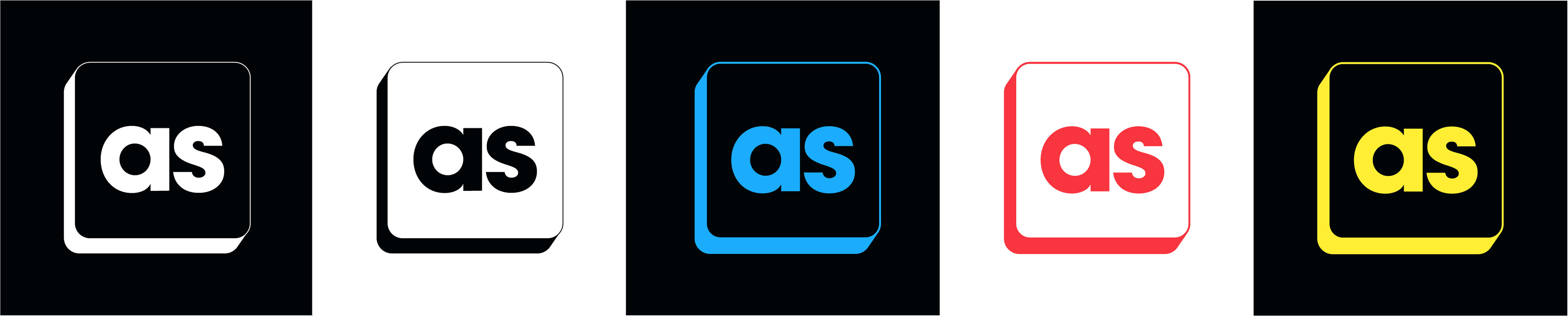
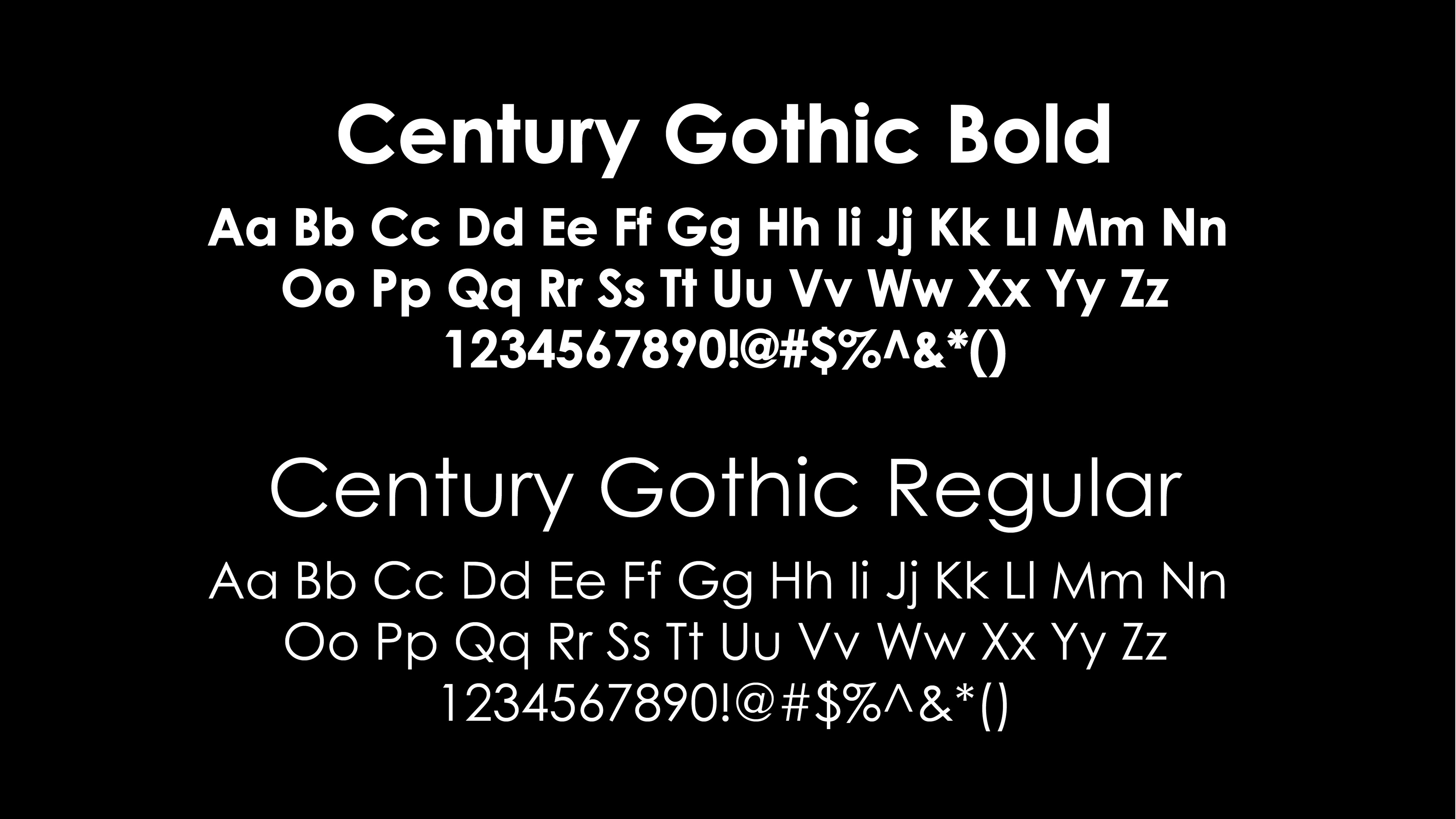
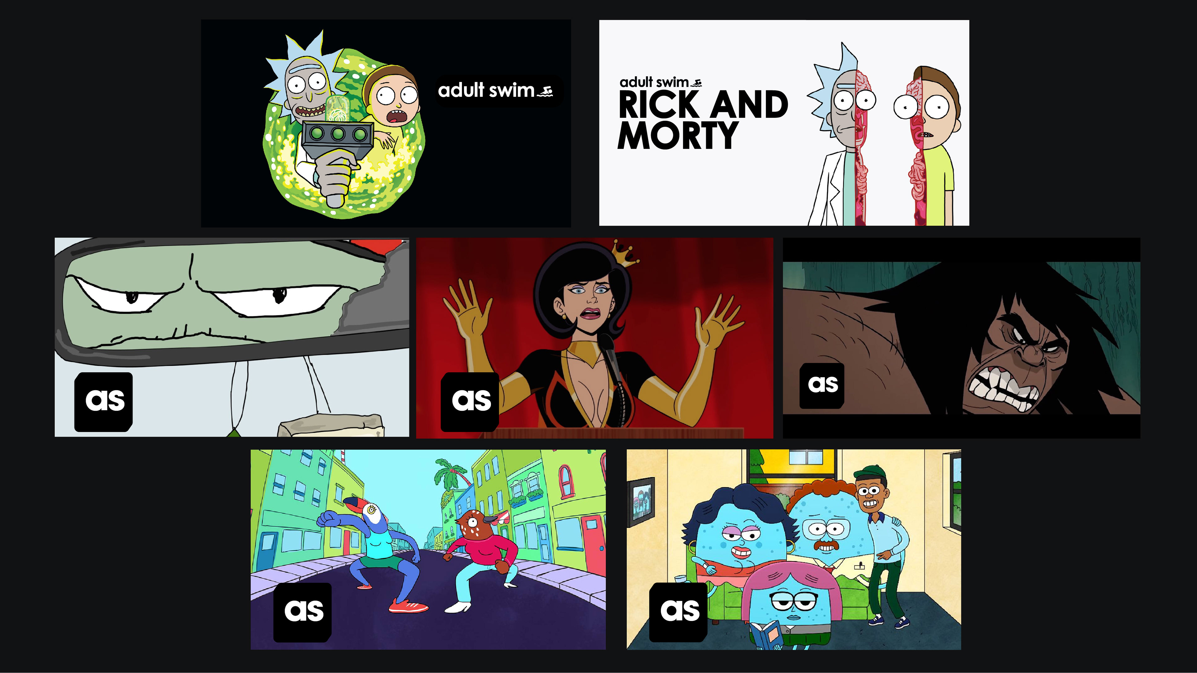
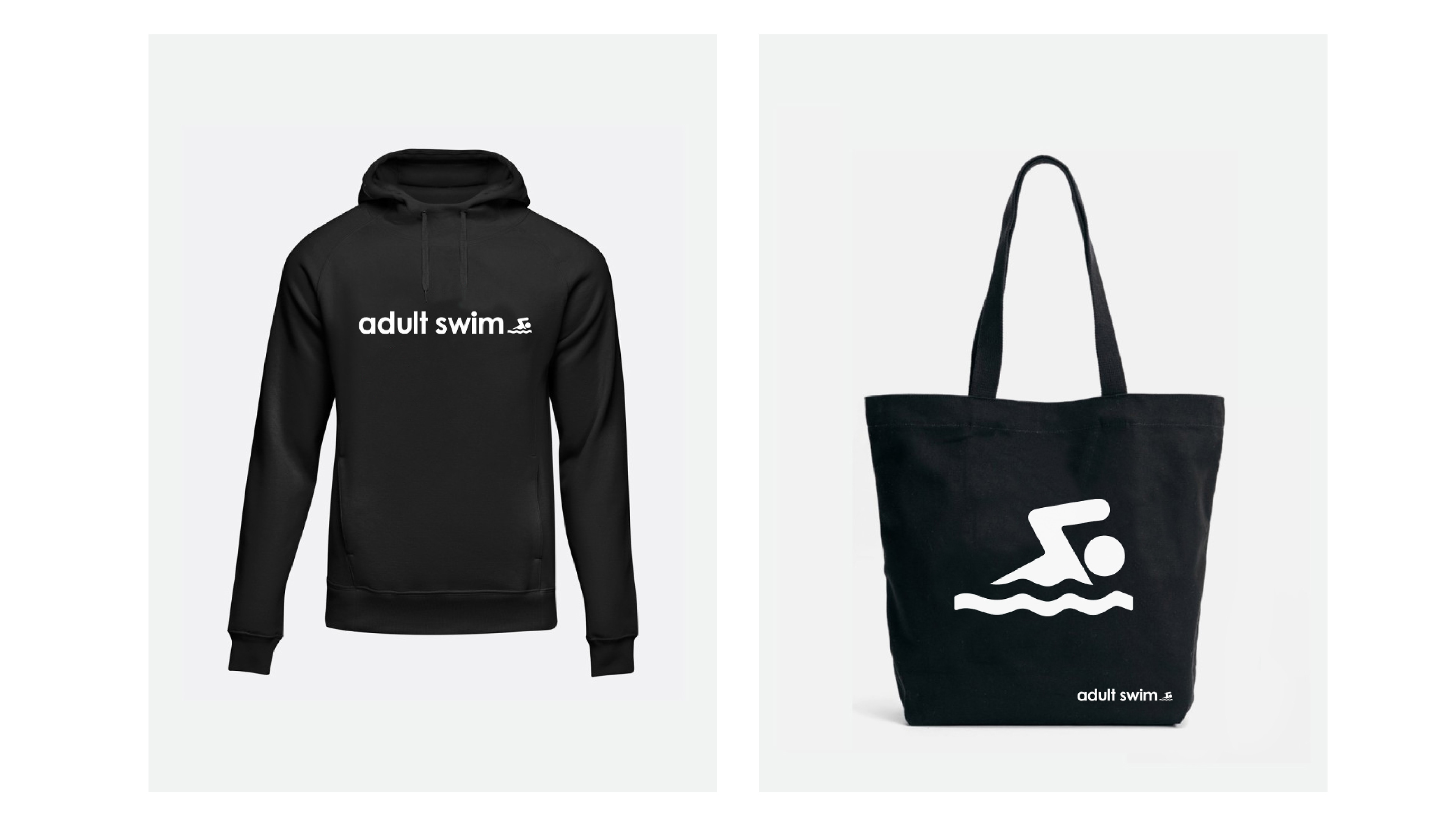
For the new logo design I went with simple but bold san serif typeface,
to try and keep a similar yet modern design.
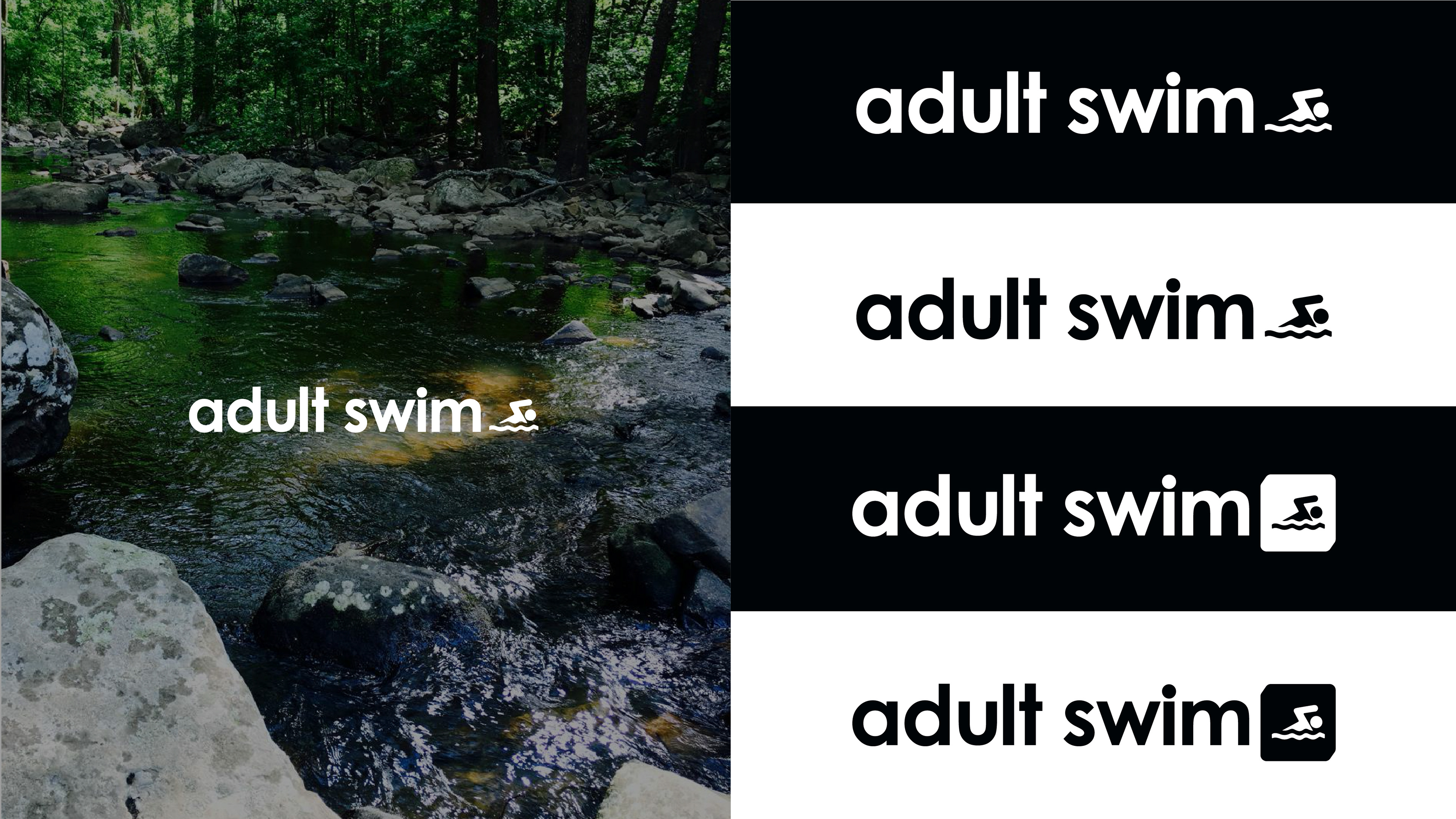
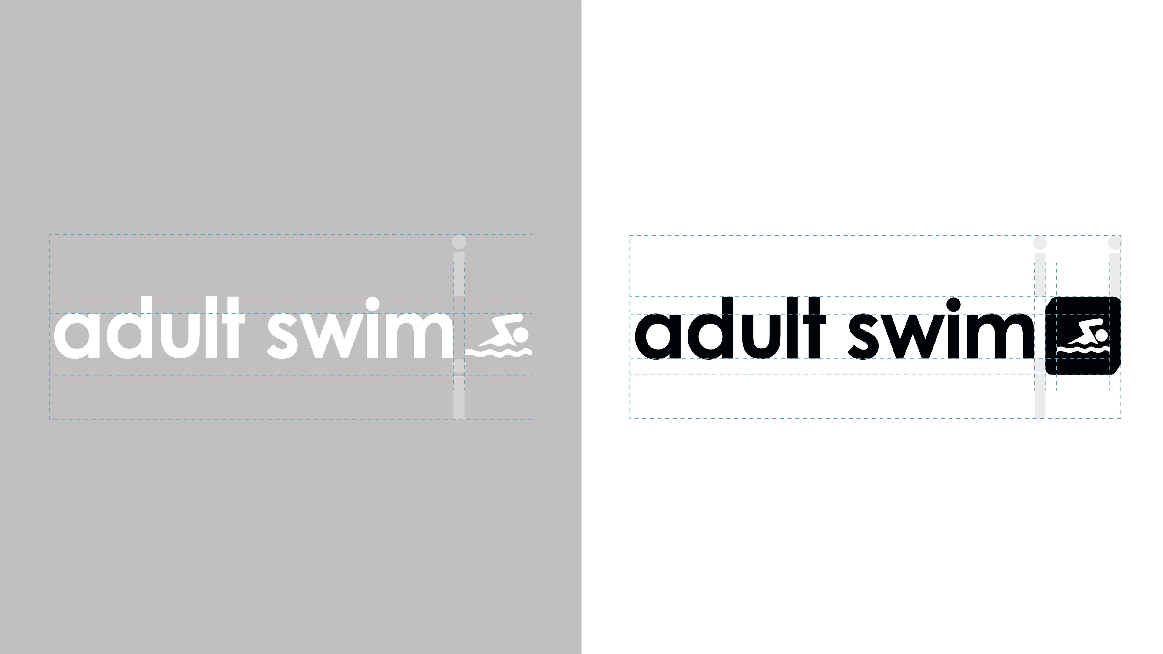
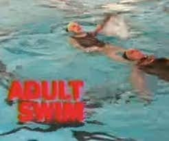
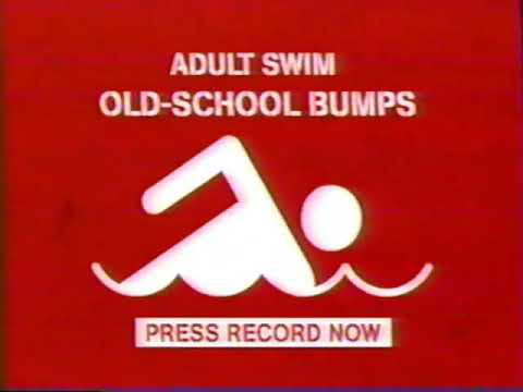
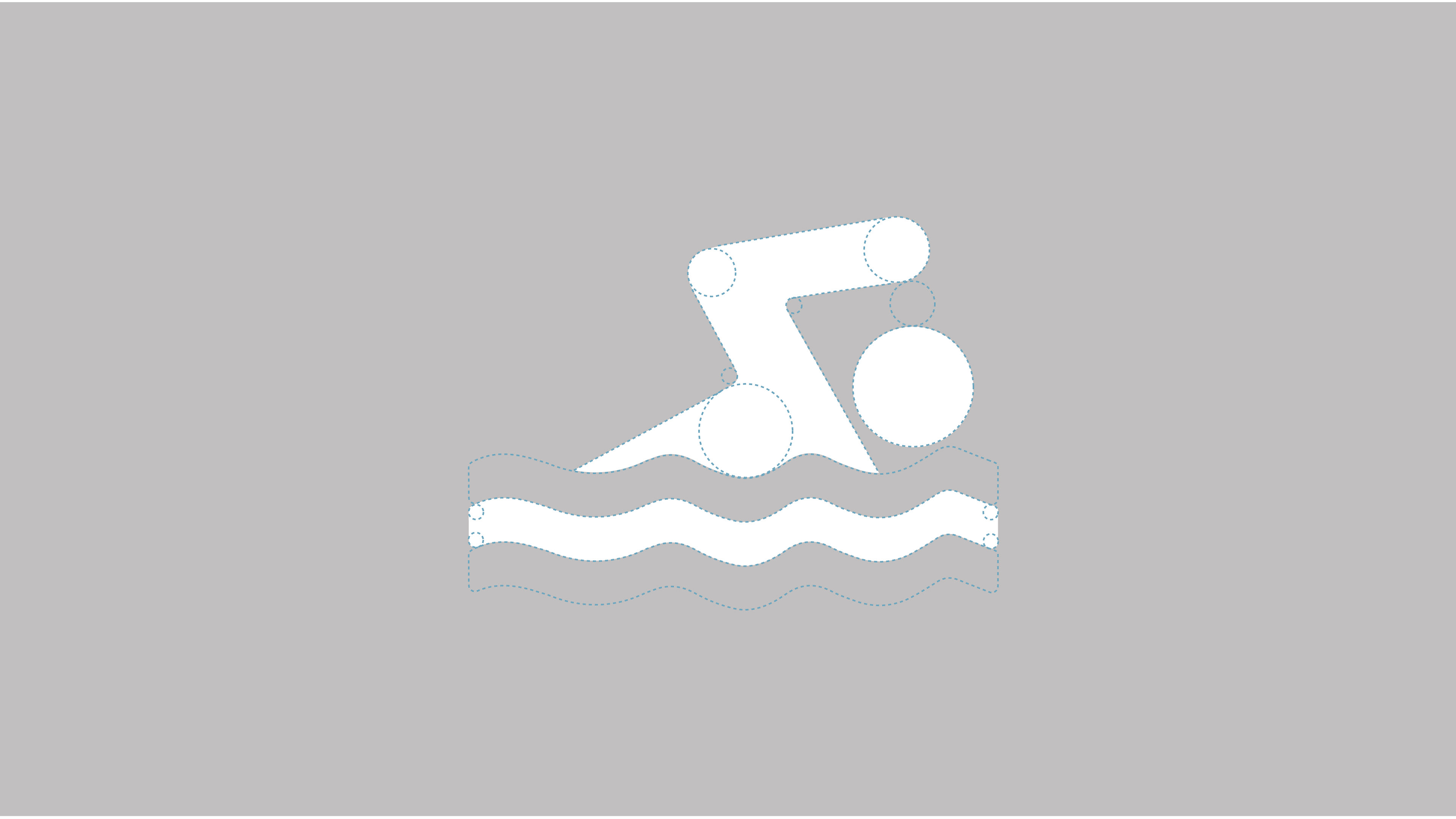
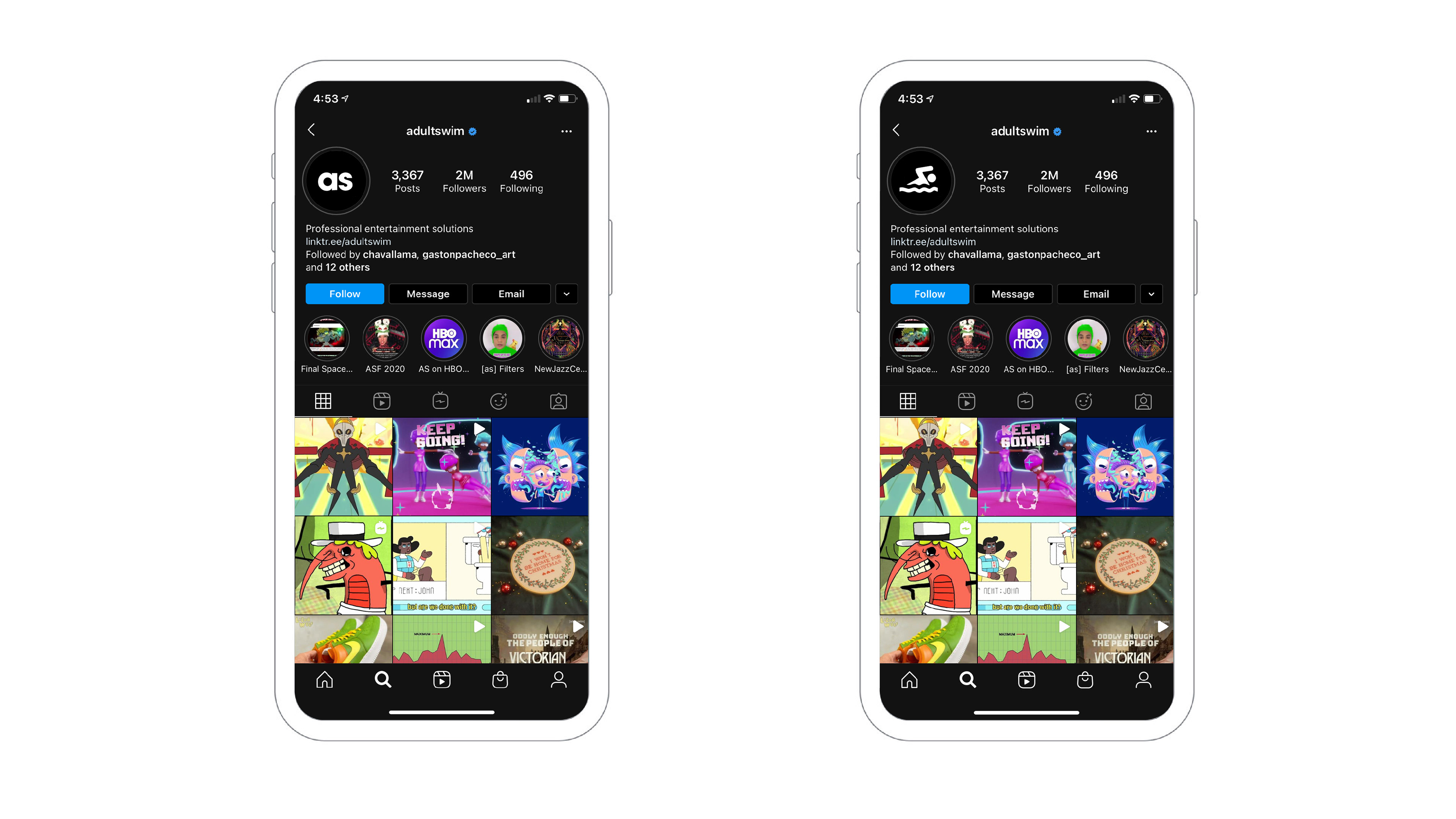
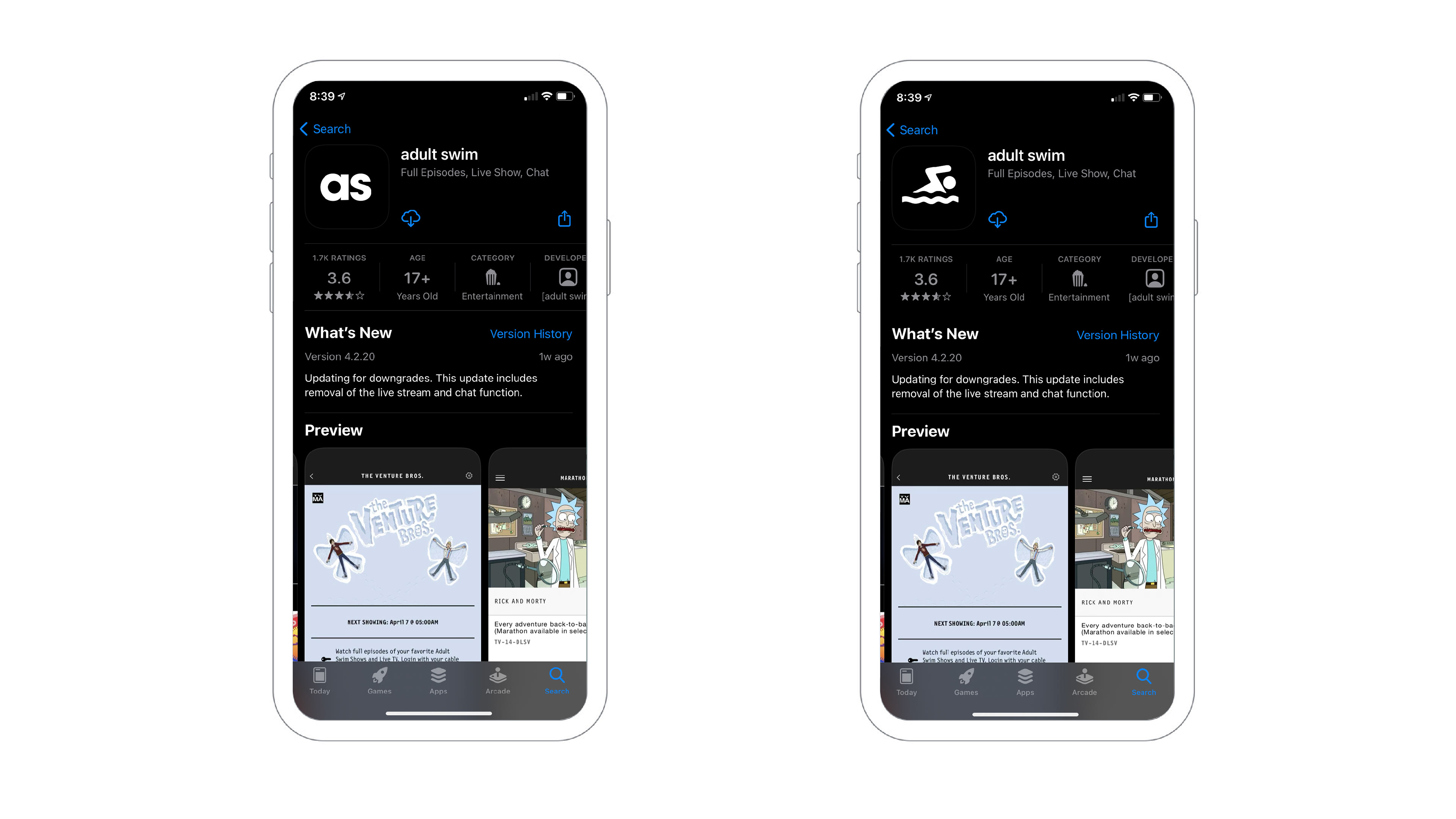
For this logo icon I decided to go in a more literal direction by referencing
their first campaign of elderly people at the swimming pool.